
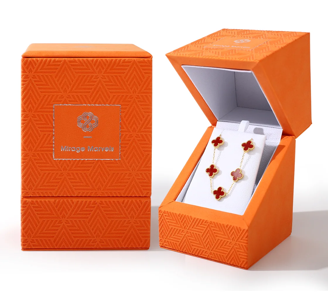
Colour, surface pattern and logo placement should be reviewed as one composition. Begin with the element that should attract attention, then judge how the other details support it at the size of the finished box.
Set the colour relationship
An orange exterior and light-coloured interior create different backgrounds for the brand mark and the jewelry. Compare that relationship with the actual item under the intended display lighting. Select colours for the presentation you want; colour does not establish material quality or protective performance.
Balance pattern and open space
The geometric surface pattern and the framed logo area illustrate two different visual roles. The pattern covers a broad area, while the logo occupies a defined space. On a new design, compare versions with more or less space around the mark so that the artwork remains readable.
Judge the logo at finished size
Check the lettering and line details on the selected surface, including the relationship between the mark, border and surrounding pattern. Review an actual-size sample instead of relying only on an enlarged screen image. Confirm the printing or finishing method separately; appearance alone does not identify the process.
Carry the composition into a design brief
Specify the colour references, artwork size and position, intended surface appearance and interior colour. If several box sizes are needed, review each layout rather than scaling the artwork without checking it. Keep the approved artwork and sample together for the final comparison.
This visual review addresses appearance. For how the recipient opens and handles the components, continue to the layered packaging guide.