
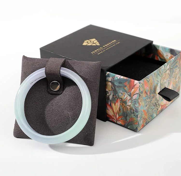
A black packaging direction should be chosen by comparing the intended brand tone, jewelry and artwork together. Black is a color choice, not a promise of luxury, material quality or better sales.
Start with the intended impression
Describe the collection in concrete terms: restrained or expressive, formal or casual, logo-led or item-led. Use those decisions to compare a dark direction with the other color references in the brief.
Decide what carries the identity
Choose whether the exterior color, a logo, a label or an interior detail should be most recognizable. Keep the proposed mark at its actual size so that the design is assessed as a finished package rather than an enlarged graphic.
Separate visual approval from specification
A black exterior can be developed with different surfaces and structures. Define the desired appearance first, then confirm material, insert, closure and artwork method for the selected format. Color alone does not establish those features.
Document the chosen direction
Keep a color reference and a clear description of the intended brand impression with the approved design. Check display lighting, individual samples and coordination across box sizes as separate decisions before production.
Related references: black box set example.